What Is the Spacer and How Do We Use It in SwiftUI
Table of Contents
Abstract
In this article, we will learn about Spacer in SwiftUI. We will dive into the world of Spacer. Exploring their purpose, functionality and practical applications. This article is part of the SwiftUI Series - SwiftUI Series - Updating TTBaseUIKit to support SwiftUI
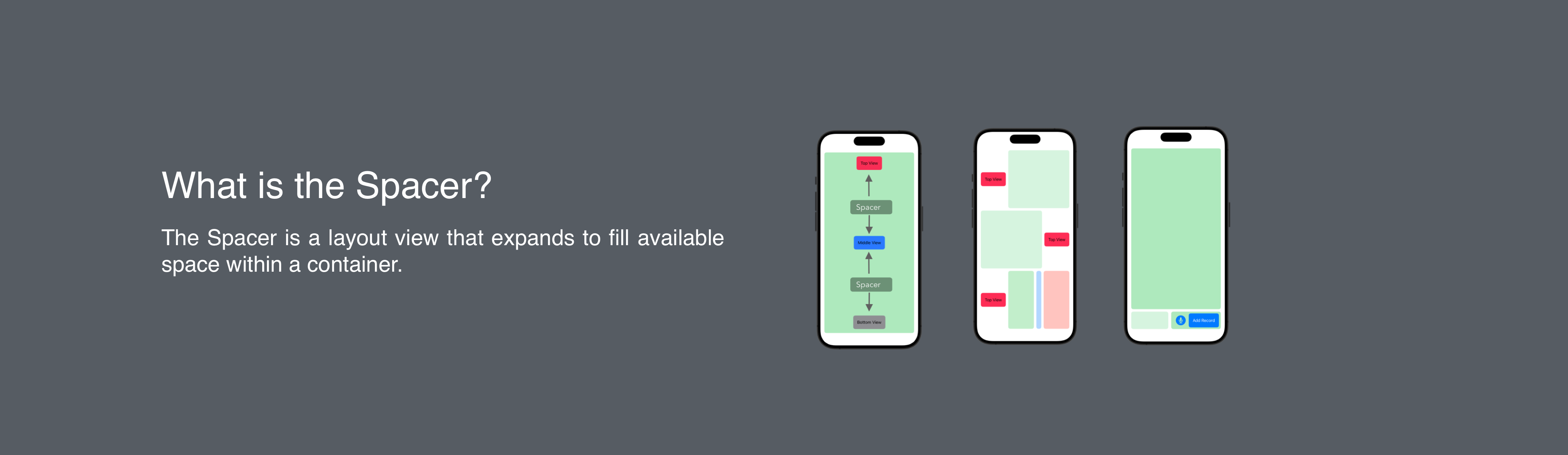
What is the Spacer?
The Spacer is a layout view that expands to fill available space within a container.
Here is the definition from Apple. You can view full details at developer.apple
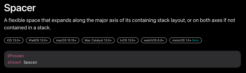
Spacer - Developer Apple
Let’s Code?
What Is the Spacer and How Do You Use It in SwiftUI
Basic
Here are a few examples of how you can use the Spacer view in SwiftUI
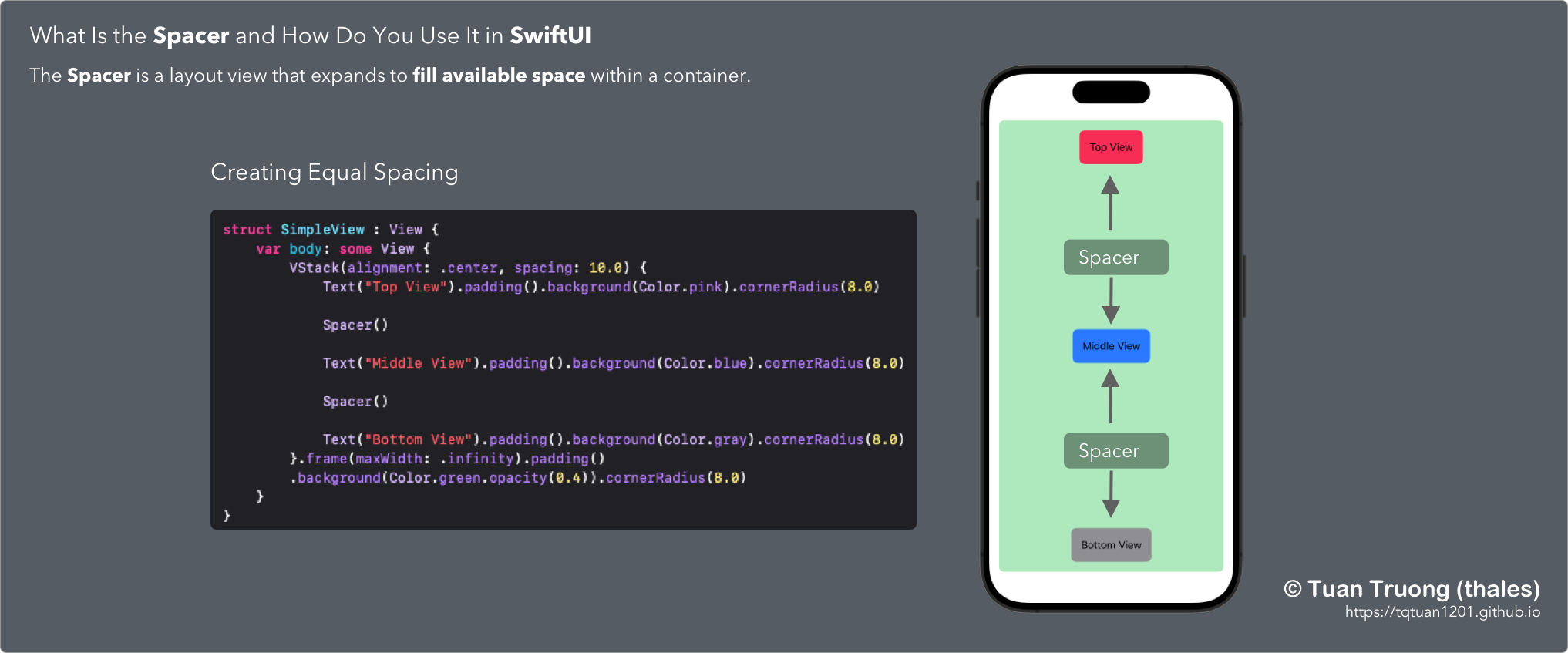
Example 1: Creating Equal Spacing
In this example, the Spacer views evenly distribute the available space between the Text views vertically, creating equal spacing between them. The Spacer views will expand to fill the available space, pushing the Text views towards the top and bottom edges.
struct SimpleView : View {
    var body: some View {
        VStack(alignment: .center, spacing: 10.0) {
            Text("Top View").padding().background(Color.pink).cornerRadius(8.0)

            Spacer()

            Text("Middle View").padding().background(Color.blue).cornerRadius(8.0)

            Spacer()

            Text("Bottom View").padding().background(Color.gray).cornerRadius(8.0)
        }.frame(maxWidth: .infinity).padding()
        .background(Color.green.opacity(0.4)).cornerRadius(8.0)
    }
}
Example 2: Creating Flexible Spacing
Here, the Spacer view is used within an HStack to create flexible spacing between the “Leading” and “Trailing” Text views. The Spacer has a minLength parameter set to 50, which means it will expand to fill the available space but will not shrink below 50 points. This creates a minimum spacing between the two Text views.
HStack {
    Text("Leading")
    Spacer(minLength: 50)
    Text("Trailing")
}
Example 3: Expanding a View
VStack {
    Text("Top")
    Spacer()
    Text("Bottom")
        .frame(maxHeight: .infinity)
}
In this example, the Spacer view is used to push the “Bottom” Text view to the bottom of the screen. By setting the frame of the “Bottom” view with maxHeight: .infinity, it will expand to fill all the available space below the “Top” view.
Customizing - (TTBaseSUISpacer)
In SwiftUI, the Spacer view is primarily used for layout and spacing purposes, and it doesn’t have direct properties to change background color or set corner radius. However, we can create a customizing class to add some commonly used functions.
public struct TTBaseSUISpacer: View {

    public var maxWidth:CGFloat? = nil
    public var maxHeight:CGFloat? = nil
    public var viewDefBgColor: Color = .clear //TTBaseUIKitConfig.getViewConfig().viewStackDefColor
    public var viewDefCornerRadius: CGFloat = 0


    public init() {
    }

    public init(maxHeight: CGFloat? = nil) {
        self.maxHeight = maxHeight
    }

    public init(maxWidth: CGFloat? = nil) {
        self.maxWidth = maxWidth
    }

    public init(maxWidth: CGFloat? = nil, maxHeight:CGFloat?) {
        self.maxWidth = maxWidth
        self.maxHeight = maxHeight
    }

    public init(withBg bg:Color, radius:CGFloat, maxWidth: CGFloat) {
        self.viewDefBgColor = bg
        self.viewDefCornerRadius = radius
        self.maxWidth = maxWidth
    }

    public init(withBg bg:Color, radius:CGFloat, maxHeight: CGFloat) {
        self.viewDefBgColor = bg
        self.viewDefCornerRadius = radius
        self.maxHeight = maxHeight
    }

    public init(withBg bg:Color, radius:CGFloat, maxWidth: CGFloat? = nil, maxHeight:CGFloat? = nil) {
        self.viewDefBgColor = bg
        self.viewDefCornerRadius = radius
        self.maxWidth = maxWidth
        self.maxHeight = maxHeight
    }

    public var body: some View {
        Rectangle()
            .foregroundColor(self.viewDefBgColor)
            .frame(maxWidth: self.maxWidth, maxHeight: self.maxHeight)
            .cornerRadius(self.viewDefCornerRadius)
    }

}
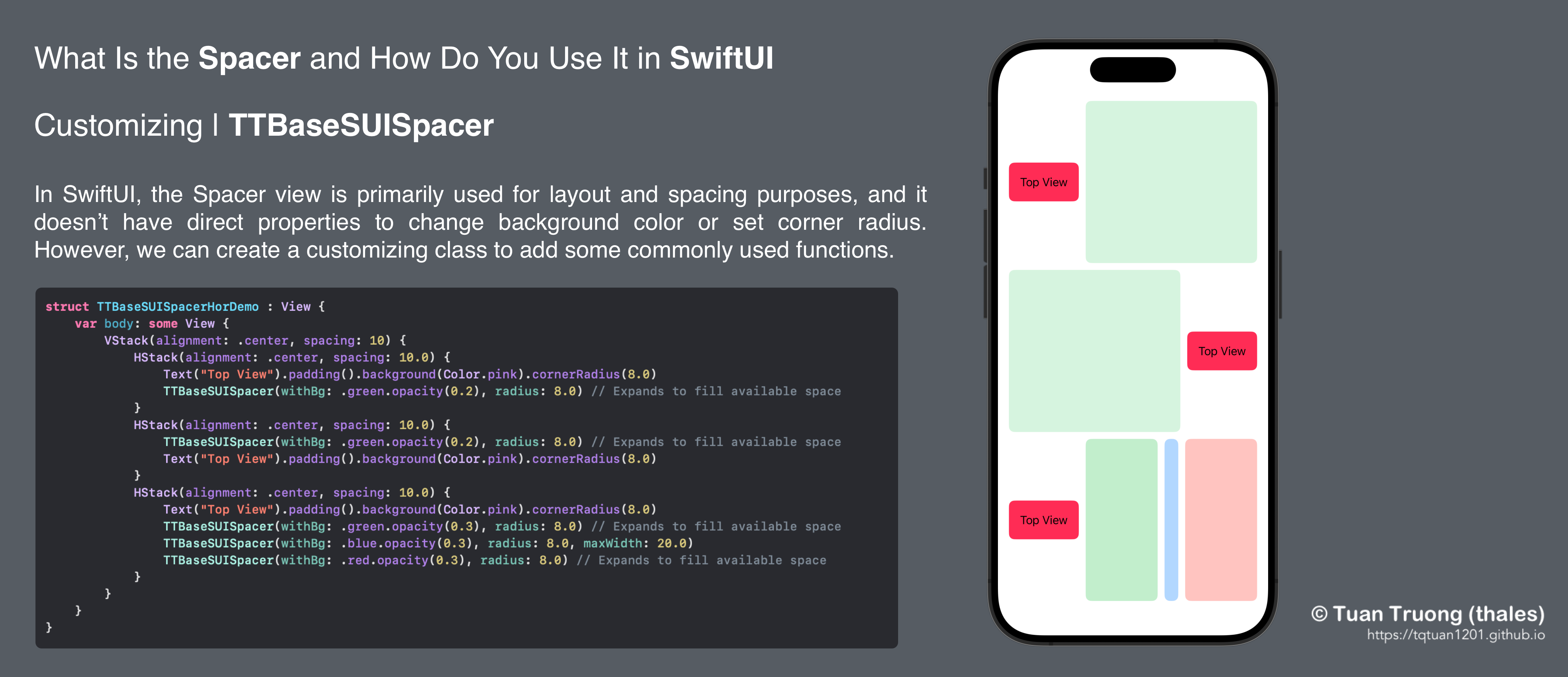
Spacer customizing - TTBaseSUISpacer
struct TTBaseSUISpacerHorDemo : View {
    var body: some View {
        VStack(alignment: .center, spacing: 10) {
            HStack(alignment: .center, spacing: 10.0) {
                Text("Top View").padding().background(Color.pink).cornerRadius(8.0)
                TTBaseSUISpacer(withBg: .green.opacity(0.2), radius: 8.0) // Expands to fill available space
            }
            HStack(alignment: .center, spacing: 10.0) {
                TTBaseSUISpacer(withBg: .green.opacity(0.2), radius: 8.0) // Expands to fill available space
                Text("Top View").padding().background(Color.pink).cornerRadius(8.0)
            }
            HStack(alignment: .center, spacing: 10.0) {
                Text("Top View").padding().background(Color.pink).cornerRadius(8.0)
                TTBaseSUISpacer(withBg: .green.opacity(0.3), radius: 8.0) // Expands to fill available space
                TTBaseSUISpacer(withBg: .blue.opacity(0.3), radius: 8.0, maxWidth: 20.0)
                TTBaseSUISpacer(withBg: .red.opacity(0.3), radius: 8.0) // Expands to fill available space
            }
        }
    }
}
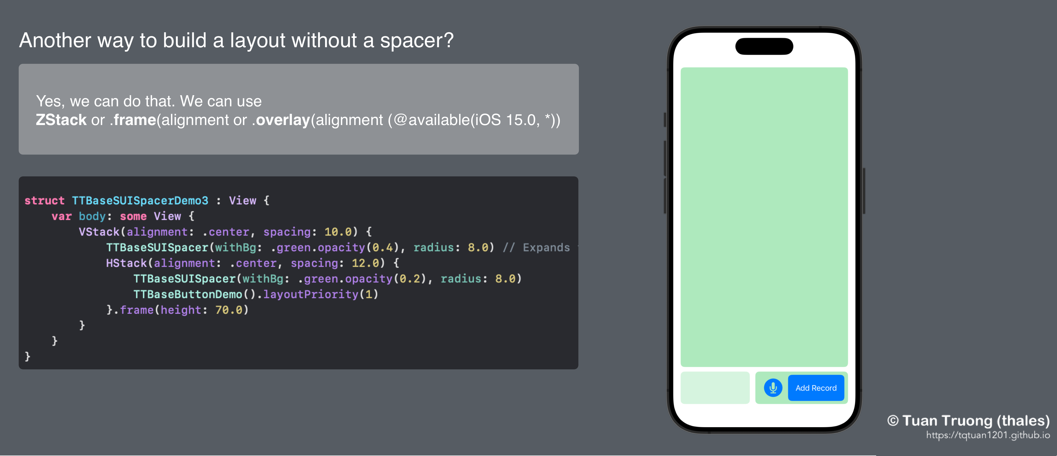
Another way to build a layout without a spacer?
ZStack or frame(alignment or overlay(alignment (@available(iOS 15.0, *))
Here is the layout written by Spacer:
//ButtonView
struct TTBaseButtonDemo : View {
    var body: some View {
        ZStack(alignment: .trailing) {
            Color.green.opacity(0.4)
            HStack(alignment: .center, spacing: 12.0) {
                Image(systemName: "mic.circle.fill")
                    .resizable().renderingMode(.template).aspectRatio(contentMode: .fit)
                    .foregroundColor(Color.blue)

                    .frame(width: 40.0, height:40.0, alignment: .center)
                Text("Add Record").foregroundColor(.white).padding().background(Color.blue).cornerRadius(8.0)
            }.padding(.trailing, 8)
        }.frame(height: 70.0).frame(width: 200).cornerRadius(8.0)
    }
}
//View
struct TTBaseSUISpacerDemo3 : View {
    var body: some View {
        VStack(alignment: .center, spacing: 10.0) {
            TTBaseSUISpacer(withBg: .green.opacity(0.4), radius: 8.0) // Expands to fill available space
            HStack(alignment: .center, spacing: 12.0) {
                TTBaseSUISpacer(withBg: .green.opacity(0.2), radius: 8.0)
                TTBaseButtonDemo().layoutPriority(1)
            }.frame(height: 70.0)
        }
    }
}
Another way to build a layout without a spacer?
Now, we will update the code without using the Spacer
Using ZStack
//Using ZStack
struct TTBaseSUINoSpacerDemo3 : View {
    var body: some View {
        ZStack(alignment: .bottomTrailing) {
            Color.green.opacity(0.4)
            TTBaseButtonDemo()
        }
    }
}
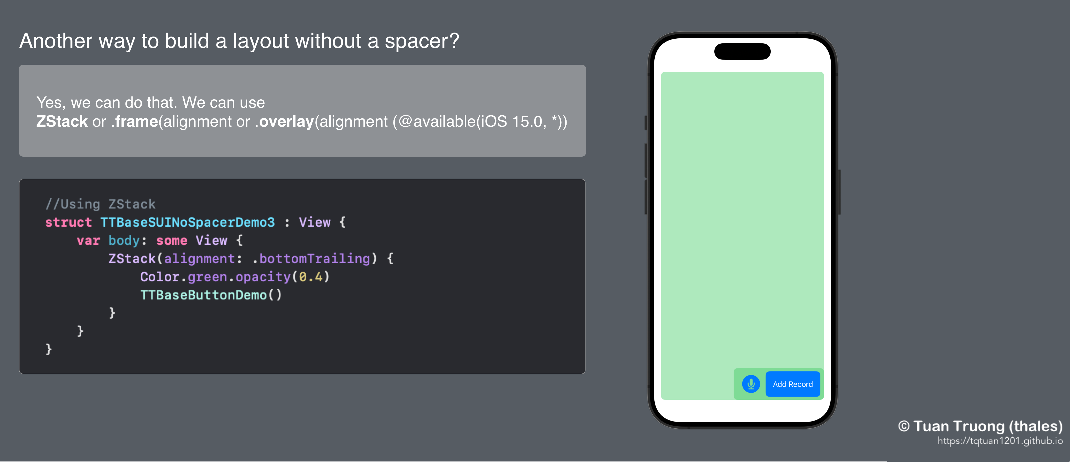
Using ZStack
Using .frame(alignment
//Using .frame
struct TTBaseSUINoSpacerDemo4 : View {
    var body: some View {
        VStack(content: {
            TTBaseButtonDemo().frame(alignment: .bottomTrailing)
        }).padding().frame(maxWidth: .infinity, maxHeight: .infinity, alignment: .bottomTrailing)
    }
}
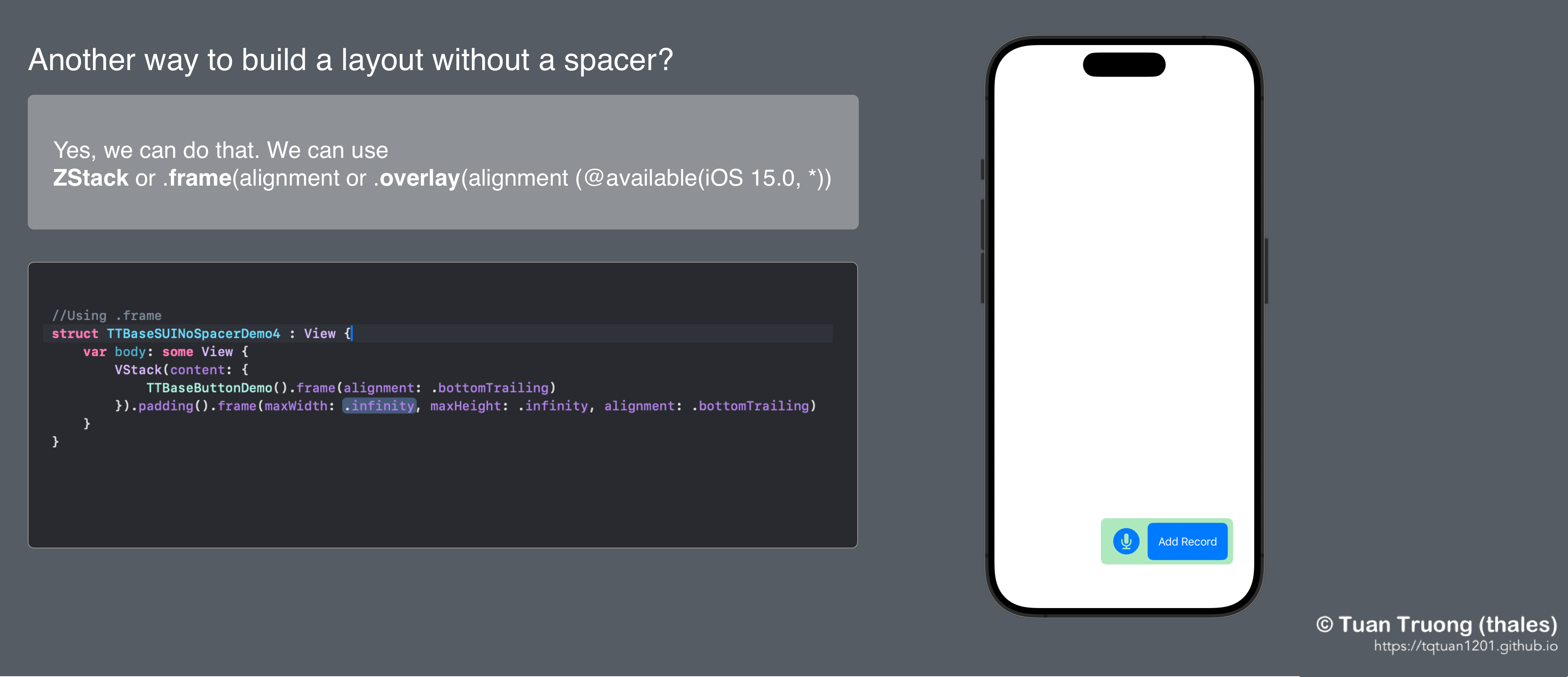
.frame(alignment
Using .overlay(alignment (@available(iOS 15.0, *))
//Using overlay(alignment
@available(iOS 15.0, *)
struct TTBaseSUINoSpacerDemo5 : View {
    var body: some View {
        Color.green.opacity(0.4).overlay(alignment: .bottomTrailing) {
            TTBaseButtonDemo()
        }
    }
}
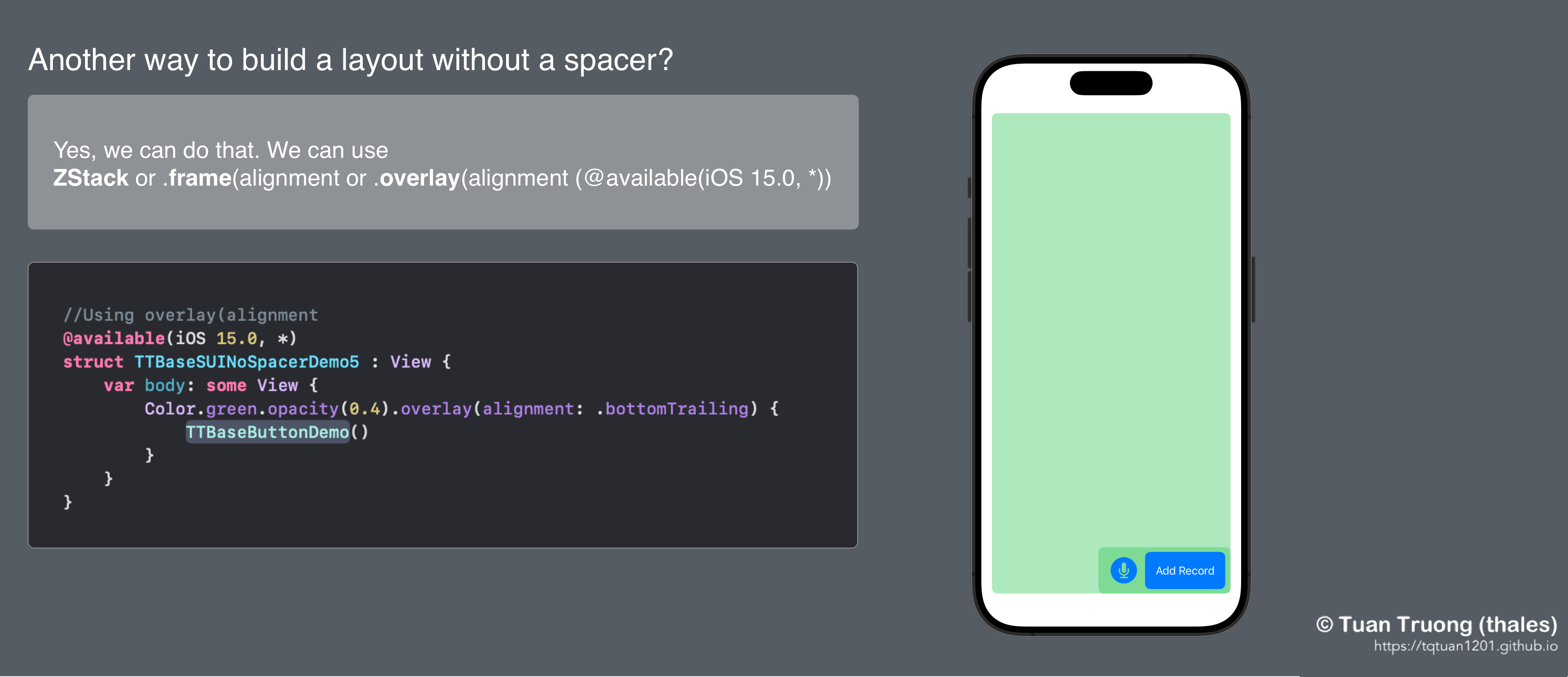
Using .overlay(alignment
Conclusion
That’s all about Spacer that I discovered. In the real world, we have many ways to build layouts. Keep exploring SwiftUI’s vast array of features to unlock its full potential in your app development journey.
Posts in this Series
- New Feature: Smart New Version Check & UIKit Previews Since Version 2.2.2
- New Feature: UI Debugging in TTBaseUIKit Since Version 2.2.1
- TTBaseUIKit Has Been Integrated With SwiftUI Since Version 2.1.0
- Rebuiding Train Booking Feature by SwiftUI in 12Bay Application - Design
- What Is the Spacer and How Do We Use It in SwiftUI
- 12Bay Integrated SwiftUI. With 12Bay, No StoryBoard, No XIB Files, No Cocoapods, ...
- Understand View in SwiftUI
- Understand Safe Area in SwiftUI
- WWDC23 From the Perspective of an IOS Developer
- SwiftUI Series - Updating TTBaseUIKit to Support SwiftUI
If you enjoy reading my articles and find them helpful, please support me. Your support will encourage me to create and share more content with you ^^
By me a coffee