Getting Started
v2.3.0Install TTBaseUIKit and configure your iOS project in under 5 minutes. Supports SPM, CocoaPods, Carthage, and manual integration.
📦 Installation
Swift Package Manager (Recommended)
The easiest way to add TTBaseUIKit:
- Go to File → Add Packages... in Xcode
- Enter the repository URL
- Choose "Up to Next Major" with version
2.3.0or higher
// Package.swift
dependencies: [
    .package(url: "https://github.com/tqtuan1201/TTBaseUIKit.git",
             .upToNextMajor(from: "2.3.0"))
]

// Or use the master branch:
dependencies: [
    .package(url: "https://github.com/tqtuan1201/TTBaseUIKit.git",
             branch: "master")
]
CocoaPods
Add to your Podfile:
pod 'TTBaseUIKit'Carthage
Add to your Cartfile:
github "tqtuan1201/TTBaseUIKit"Manual
- Put TTBaseUIKit repo somewhere in your project directory
- In Xcode, add
TTBaseUIKit.xcodeprojto your project - On your app's target: add as an embedded binary on General tab, and as a target dependency on Build Phases tab
⚙️ Basic Configuration
Configure TTBaseUIKit in your AppDelegate.swift. The framework uses 5 config objects:
Config Objects:
ViewConfig (colors), SizeConfig (dimensions), FontConfig (typography), StyleConfig (behaviors), ParamConfig (parameters)
import UIKit
import TTBaseUIKit

@UIApplicationMain
class AppDelegate: UIResponder, UIApplicationDelegate {
    var window: UIWindow?

    func application(_ application: UIApplication,
                     didFinishLaunchingWithOptions launchOptions:
                     [UIApplication.LaunchOptionsKey: Any]?) -> Bool {

        // ── View Configuration (Colors) ──
        let view = ViewConfig()
        view.viewBgNavColor = UIColor.getColorFromHex(netHex: 0x4DA0DC)
        view.buttonBgDef = UIColor.getColorFromHex(netHex: 0x4DA0DC)
        view.buttonBgWar = UIColor.getColorFromHex(netHex: 0xC41F53)
        view.buttonBgDis = UIColor.gray.withAlphaComponent(0.4)
        view.viewBgColor = UIColor.white
        view.viewBgCellColor = UIColor.white
        view.lineDefColor = UIColor.getColorFromHex(netHex: 0xEDEDED)

        // ── Font Configuration ──
        let fontConfig = FontConfig()
        fontConfig.HEADER_SUPER_H = 24
        fontConfig.HEADER_H = 18
        fontConfig.TITLE_H = 14
        fontConfig.SUB_TITLE_H = 12
        fontConfig.SUB_SUB_TITLE_H = 10

        // ── Size Configuration ──
        let sizeConfig = SizeConfig()
        sizeConfig.H_BUTTON = 50.0
        sizeConfig.H_TEXTFIELD = 50.0
        sizeConfig.CORNER_RADIUS = 8.0
        sizeConfig.CORNER_BUTTON = 8.0

        // ── Style & Params ──
        let styleConfig = StyleConfig()
        styleConfig.dismissKeyboardType = .TEXT

        let paramsConfig = ParamConfig()
        paramsConfig.forceUpdateNewVersion = false

        // ── Apply Configuration ──
        TTBaseUIKitConfig.withDefaultConfig(
            withFontConfig: fontConfig,
            frameSize: sizeConfig,
            view: view,
            style: styleConfig,
            params: paramsConfig
        )?.start(withViewLog: true)

        // ── Window Setup ──
        self.window = UIWindow(frame: UIScreen.main.bounds)
        self.window!.rootViewController = UINavigationController(
            rootViewController: YourViewController()
        )
        self.window!.makeKeyAndVisible()

        return true
    }
}
🎨 ViewConfig Reference
Controls all colors across the framework:
| Property | Type | Description |
|---|---|---|
viewBgColor | UIColor | Default background color for views |
viewBgNavColor | UIColor | Navigation bar background color |
viewBgLoadingColor | UIColor | Loading indicator color |
viewBgCellColor | UIColor | Table/Collection cell background |
buttonBgDef | UIColor | Default button background |
buttonBgWar | UIColor | Warning/danger button background |
buttonBgDis | UIColor | Disabled button background |
labelBgDef | UIColor | Default label background |
labelBgWar | UIColor | Warning label background |
lineDefColor | UIColor | Default separator line color |
lineActiveColor | UIColor | Active/focused line color |
textWarringColor | UIColor | Warning text color |
📐 SizeConfig Reference
| Property | Type | Default | Description |
|---|---|---|---|
H_BUTTON | CGFloat | 50 | Default button height |
W_BUTTON | CGFloat | 147 | Default button width |
H_TEXTFIELD | CGFloat | 50 | Default text field height |
H_SEARCH_BAR | CGFloat | 46 | Search bar height |
CORNER_RADIUS | CGFloat | 8 | Default corner radius |
CORNER_BUTTON | CGFloat | 8 | Button corner radius |
H_SMALL_ICON | CGFloat | 26 | Small icon size |
H_SEG | CGFloat | 50 | Segmented control height |
🔤 FontConfig Reference
| Property | Default (≤5.8") | Default (>5.8") | Description |
|---|---|---|---|
HEADER_SUPER_H | 24 | 24 | Super header font size |
HEADER_H | 18 | 18 | Header font size |
TITLE_H | 14 | 16 | Title font size |
SUB_TITLE_H | 12 | 14 | Subtitle font size |
SUB_SUB_TITLE_H | 10 | 12 | Small text font size |
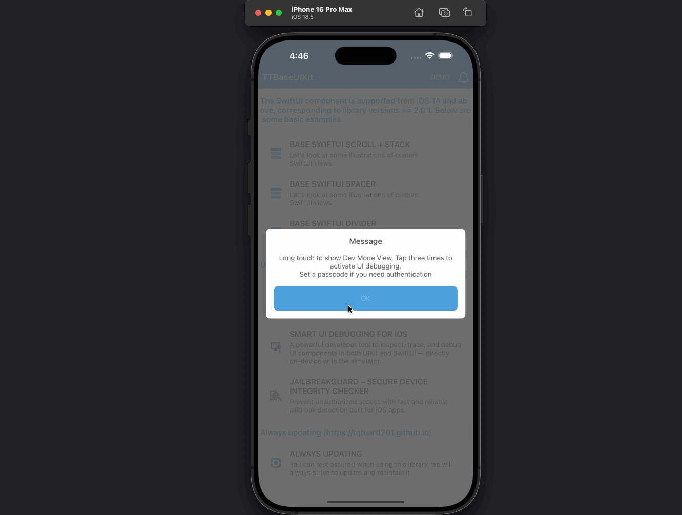
🔧 UI Debug Kit
TTBaseUIKit includes a powerful built-in debug tool to help visualize layouts and test views:
LogViewHelper.share.config(
    withDes: "Description for Developers",
    isStartAppToShow: false,
    passCode: ""
).onShow()
Pro Tip: Set a
passCode to secure the debug section. Use .onShow() to activate on any screen — just long-press to open!
Debug features include:
- SHOW LOG API RESPONSE — View all request/response data for API debugging
- DEBUG UI LAYOUT — Triple-tap any screen to inspect layout boundaries
- CAPTURE THE SCREEN — Capture and annotate screenshots
- SETTING DEV — Add custom dev settings (e.g., environment switching)