
Get ready for iPhone Duo: What iOS developers need to Change
Table of Contents
Abstract
A few years ago, I wrote about the future of mobile app development. Back then, foldable phones were an Android story, and iOS developers stayed in a comfortable single-screen world.
That changed on September 9, 2026, when Apple announced iPhone Duo. It has a 5.4-inch outer display and a 7.6-inch inner display that unfolds.
I went through Apple’s tech talks to find what really matters for an existing app. In this post, we will look at five ideas:
- Size classes, not orientation
- Navigation bars move to the side
- The fold is a reserved region
- Your app can be narrow and open twice
- Two front cameras
Let’s get started.
1. Size classes, not orientation
The same app now moves between very different shapes. Closed, it looks like a normal iPhone. Open, it looks closer to a small iPad. Partly folded, the screen has a hinge in the middle.
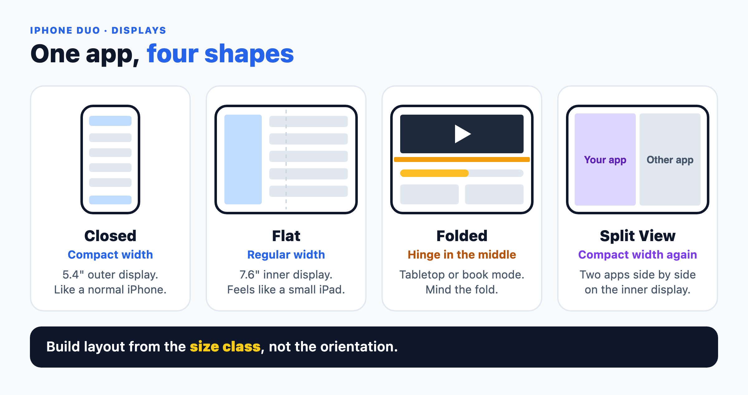
One app, four shapes
The rule that surprised me most: the inner display ignores your orientation lock. Even if Info.plist locks your app to portrait, people can turn the device, and your window can resize at any time.
So build layout from the size class, not from the device orientation:
// SwiftUI: Read size classes from the environment
@Environment(\.horizontalSizeClass) private var horizontalSizeClass
@Environment(\.verticalSizeClass) private var verticalSizeClass

// UIKit: Read size classes from traitCollection
let isCompact = traitCollection.horizontalSizeClass == .compact
Two small bugs are worth fixing at the same time.
First, UIScreen.main is deprecated in iOS 27. With two screens, “main” no longer has a clear meaning:
// Avoid this:
let scale = UIScreen.main.scale
let bounds = UIScreen.main.bounds

// Do this instead:
// In UIKit:
let scale = traitCollection.displayScale
let currentScreen = window?.windowScene?.screen

// In SwiftUI:
@Environment(\.displayScale) private var displayScale
Second, safe areas are no longer mirrored. The left inset might be 54pt to clear the side bar, while the right inset is only 16pt. Stop doubling one side:
// BUG: Never assume opposite margins are identical
let badWidth = view.bounds.width - (view.safeAreaInsets.left * 2)
// Safe: Inset bounds using the complete edge insets
let contentFrame = view.bounds.inset(by: view.safeAreaInsets)
2. Navigation bars move to the side
On the wide inner display, a top bar plus a bottom bar takes too much height. In iOS 27, Apple combines them into one vertical bar on the side edge.
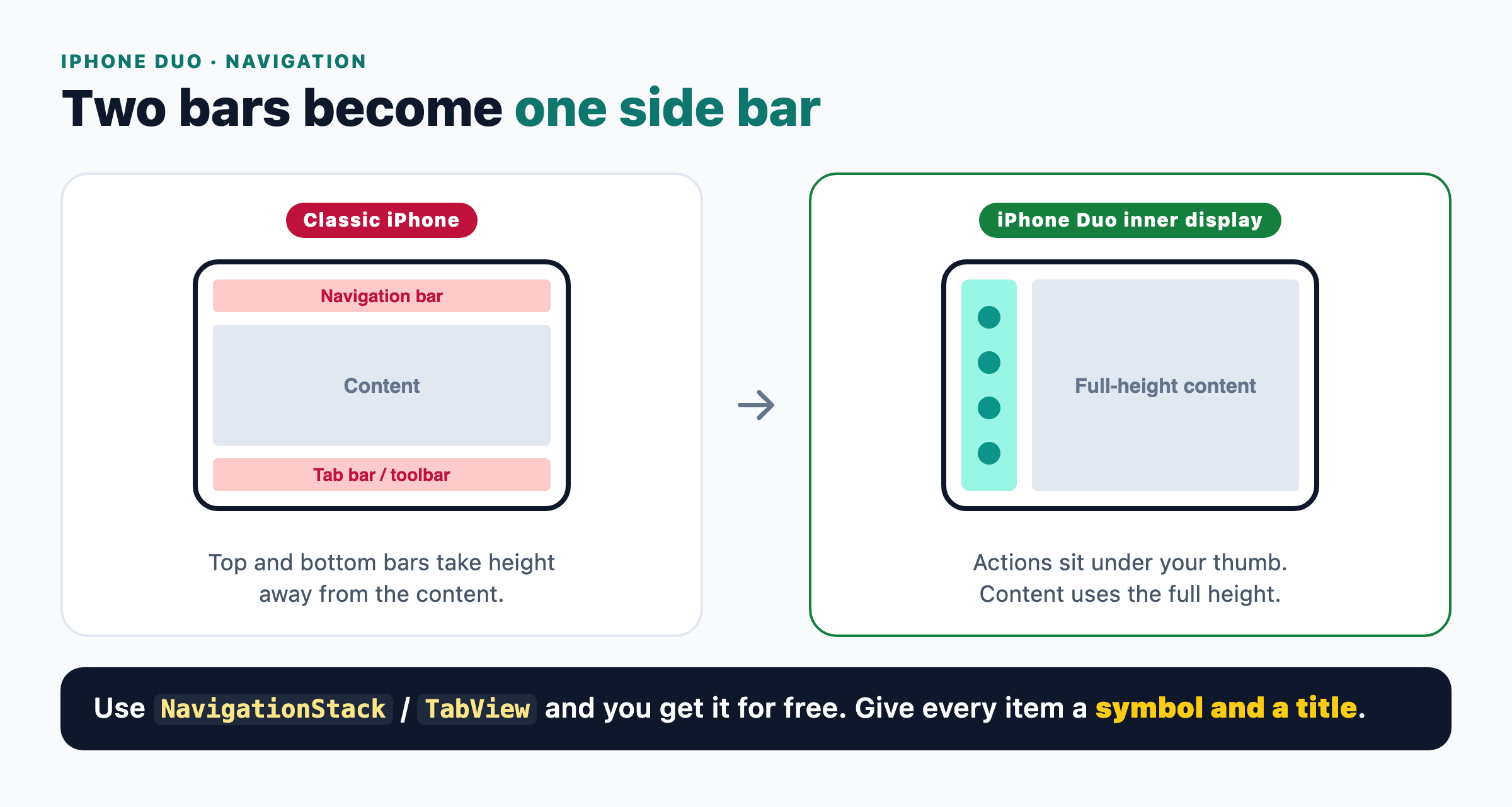
Top and bottom bars become one side bar
This gives content the full height of the screen, and the main actions stay under your thumb.
The good news: if you use the system containers, you get this for free (Tech Talk 111462). In SwiftUI, that means NavigationStack, NavigationSplitView, and TabView. In UIKit, it means UINavigationController and UITabBarController.
// SwiftUI: TabView with sidebar placement and badges [Tech Talk 111461 & 111462]
TabView {
    Tab("Inbox", systemImage: "tray") {
        InboxView()
    }
    .badge(7)

    Tab("Sent", systemImage: "paperplane") {
        SentView()
    }
}
.defaultTabBarPlacement(.sidebar)

// UIKit: Sidebar placement for UITabBarController
tabBarController.sidebar.preferredPlacement = .sidebar
One habit helps a lot here: give every bar item both an SF Symbol and a title. The side bar shows the symbol. When an item moves into the overflow menu, iOS shows the title.
3. The fold is a reserved region
When iPhone Duo is partly folded into book or tabletop mode, the hinge bends the screen. Apple calls these areas reserved regions:
.division: the hinge line. It is inactive when the device is flat..occlusion: camera cutouts that always cover some pixels.
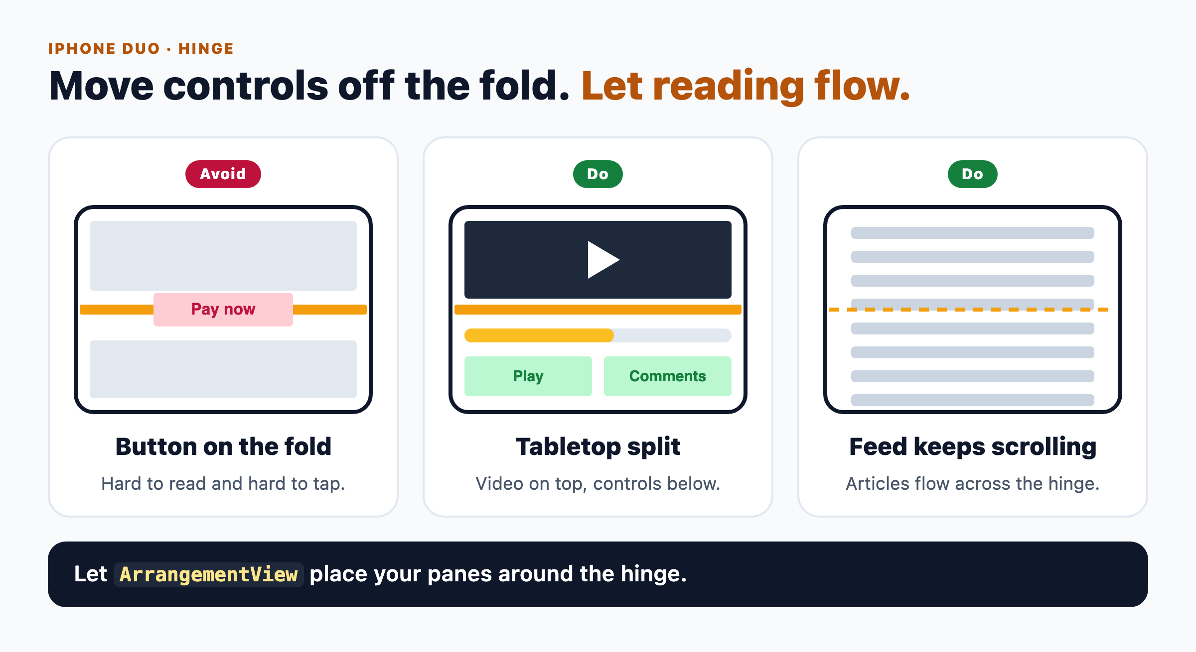
Move controls off the fold, but let reading content flow
The main idea is simple. Move controls away from the fold, but don’t break reading content. A video player can sit on the top half while the scrubber sits on the flat half. An article or a feed should just keep scrolling across the hinge.
You don’t need to write frame math for every hinge angle. iOS 27.1 adds ArrangementView in SwiftUI and UIArrangementViewController in UIKit. You give it two views, and it places them around the hinge:
// SwiftUI: Split Arrangement
struct PodcastPlayerScreen: View {
    var body: some View {
        NavigationStack {
            ArrangementView {
                NowPlayingView()
            } secondary: {
                TranscriptView()
            }
            .arrangementViewStyle(.split)
        }
    }
}
There is also an onHingeChange modifier that reports the live hinge angle. It is fun for games or music apps, but don’t use it for layout. It fires many times per second, so layout work inside it drops frames.
4. Your app can be narrow and open twice
On the inner display, people can run two apps side by side in Split View. When that happens, your app switches back to compact width. If your app already supports Split View on iPad, you are in good shape.
iPhone Duo is also the first iPhone that can open several windows of the same app, for example two documents side by side. New windows only open on the inner display.
This is where old shortcuts break. If your app keeps UI state in a global singleton, two windows will fight over it. Keep that state per scene instead.
5. Two front cameras
iPhone Duo has a front camera on each display. You can choose how much control you need:
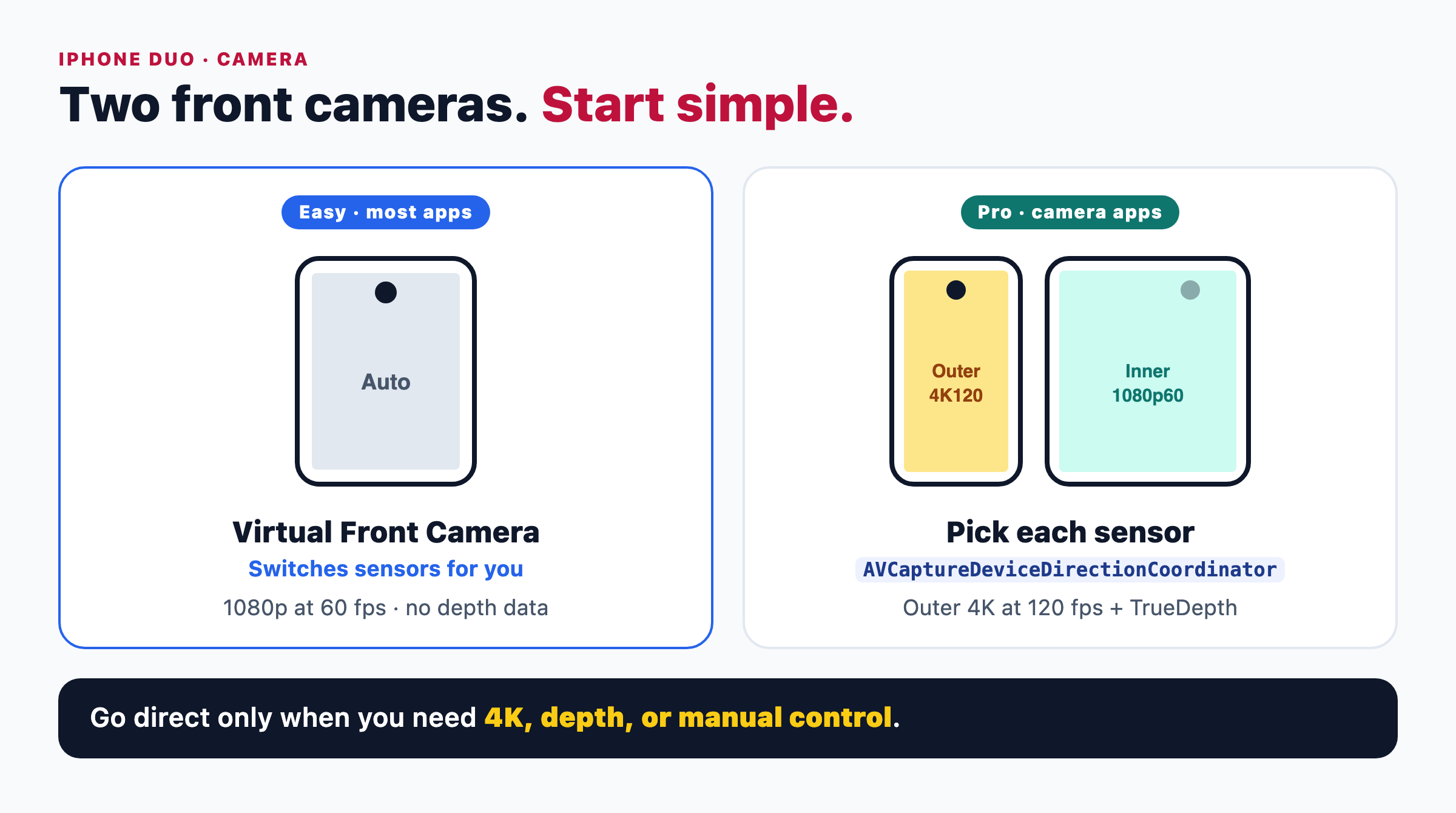
Start simple, go direct only when you need more
- The easy way: the normal front camera query returns a Virtual Front Camera. It switches sensors when the device folds or unfolds. The trade-off is 1080p at 60 fps and no depth data.
- The pro way: pick each sensor yourself and use
AVCaptureDeviceDirectionCoordinatorto know which one faces the user. You get 4K at 120 fps and TrueDepth from the outer camera.
For most video call and social apps, the easy way is enough. Camera apps can also show content on both displays at once, like controls inside and a teleprompter on the outer screen.
Before you ship
Here is the short checklist I would run on an existing app:
- Replace
UIScreen.mainwith the trait collection or window scene. - Remove layout logic based on device orientation.
- Use
view.bounds.inset(by: view.safeAreaInsets)instead of mirrored insets. - Move custom toolbars into system navigation containers.
- Give every bar item a symbol and a title.
- Keep UI state per scene, not in a global singleton.
- Test each pose in DeviceHub, the pose controller in the Xcode 27.1 iPhone Duo Simulator: closed, flat, tabletop, book, and Split View.
Conclusion
For me, iPhone Duo is the biggest change to iOS layout since iPhone X brought safe areas. But Apple’s direction stays the same. If your app already uses adaptive layouts and the standard containers, most of the work is done.
To make these ideas easy to remember, I put them on one page:
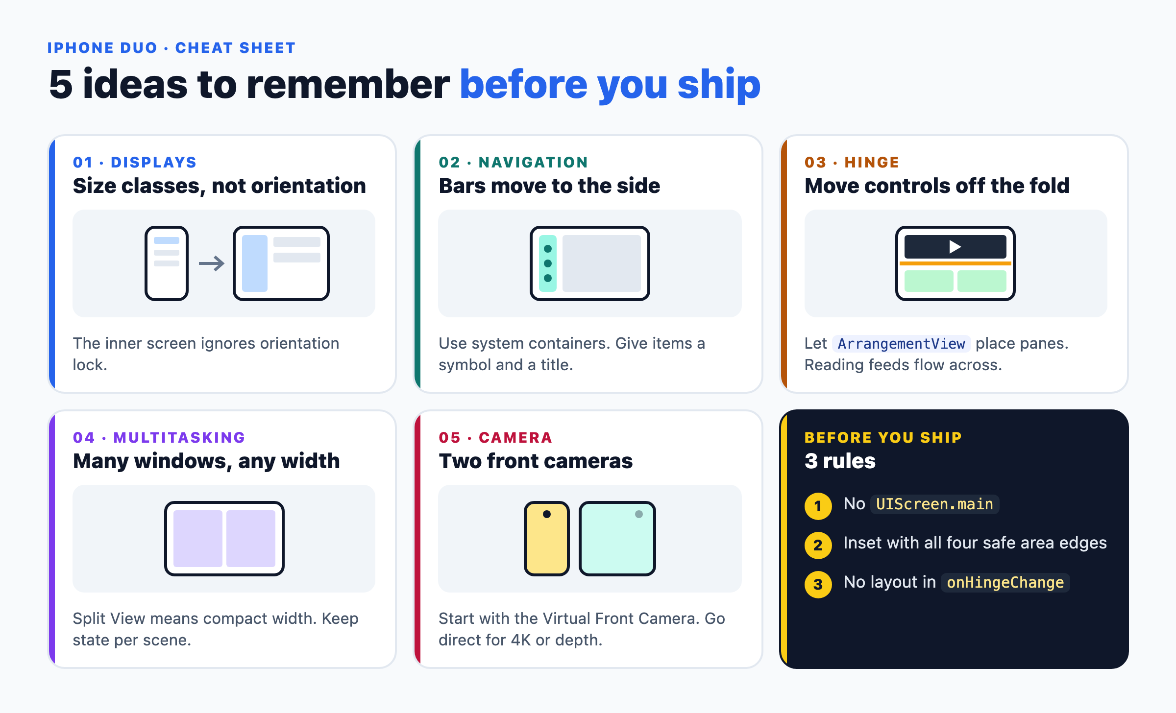
iPhone Duo: 5 mental models for iOS developers
References
Here are the official guides and tech talks referenced in this post:
Official Documentation
- Apple Developer — Get Ready for iPhone Duo: Developer portal and design overview for iPhone Duo.
- Apple Human Interface Guidelines — Designing for iPhone Duo: Layout, poses, and displacement guidelines.
- Apple Developer Videos — Prepare Your App for iPhone Duo (Tech Talk 111461): Size classes, safe areas, and DeviceHub.
- Apple Developer Videos — Raise the Bar with iPhone Duo (Tech Talk 111462): The side vertical bar and bar items.
- Apple Developer Videos — Strike a Pose with Adaptive Layouts on iPhone Duo (Tech Talk 111463): Reserved regions and
ArrangementView. - Apple Developer Videos — Leverage Multiple Displays and Scenes on iPhone Duo (Tech Talk 111464): Split View, multiple windows, hinge observation, and scene accessories.
- Apple Developer Videos — Build a Great Camera Experience for iPhone Duo (Tech Talk 111465): Virtual Front Camera and
AVCaptureDeviceDirectionCoordinator.
Community Research & Prior Art
- Tuan Truong Blog — What Is the Future of Mobile App Development (2022): My earlier post on foldable devices and where mobile development was heading.
Disclaimer & Product Attribution
Happy coding, and see you in the next post!
